

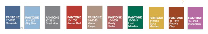
Color Spotlight: Fall Pantone Trends
A contemporary home is constantly evolving. As summer comes to an end, it’s time to start thinking about how you want to switch things up in your home. Whether it is simply adding new accent pillows to the couch or redesigning the entire kitchen, refreshing your environment at home can have positive psychological effects. According to the Pantone Fashion Color Report, this fall is all about sanguinity, strength, and serenity.
Instead of your typical fall colors like tangerine and maroon, this fall is led by the Blue family. When decorating your home for the season, don’t be afraid to combine playfulness with structure. This fall’s color palette will allow you to bring earth tones and vivacious pops of color together under one roof. Inspired by the peacefulness and optimism that this color palette generates, we created a room-by-room home décor guide just for you.
 Source: westelm.com[/caption]
[caption id="attachment_9960" align="aligncenter" width="700"]
Source: westelm.com[/caption]
[caption id="attachment_9960" align="aligncenter" width="700"]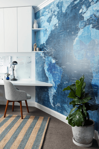 Source: houzz.com[/caption]
 Source: abeautifulmess.com[/caption]
[caption id="attachment_9970" align="aligncenter" width="700"]
Source: abeautifulmess.com[/caption]
[caption id="attachment_9970" align="aligncenter" width="700"]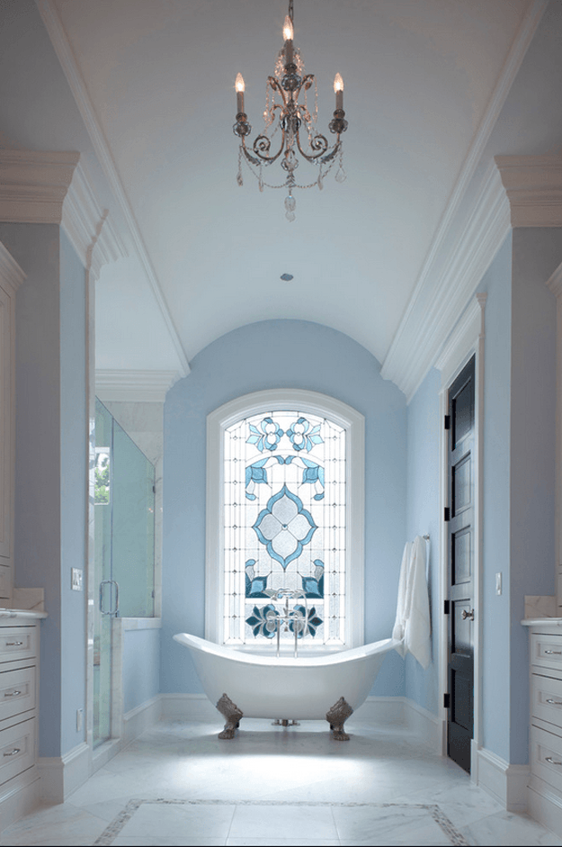 Source: houzz.com[/caption]
 Source: houzz.com[/caption]
[caption id="attachment_9956" align="aligncenter" width="700"]
Source: houzz.com[/caption]
[caption id="attachment_9956" align="aligncenter" width="700"] Source: austinbean.com[/caption]
 Source: conceptsandcolorways.com[/caption]
[caption id="attachment_9973" align="aligncenter" width="700"]
Source: conceptsandcolorways.com[/caption]
[caption id="attachment_9973" align="aligncenter" width="700"]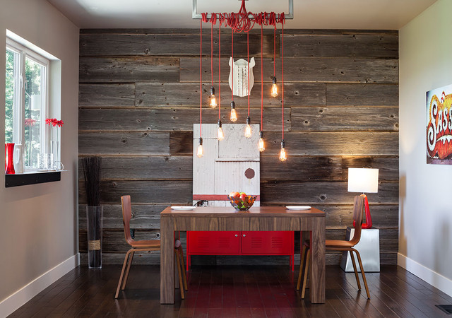 Source: houzz.com[/caption]
 Source: houzz.com[/caption]
 [caption id="attachment_9958" align="aligncenter" width="700"]
 Source: rebekkahdavies.com[/caption]
 Source: tumblr.com[/caption]
[caption id="attachment_9957" align="aligncenter" width="700"]
Source: tumblr.com[/caption]
[caption id="attachment_9957" align="aligncenter" width="700"] Source: conceptsandcolorways.com[/caption]
 Source: home-styling.blogspot.bg[/caption]
 [caption id="attachment_9954" align="aligncenter" width="700"]
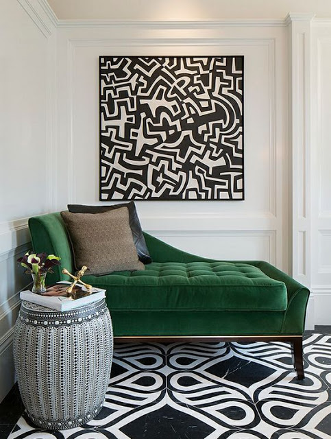 Source: home-styling.blogspot.bg[/caption]
 Source: houzz.com[/caption]
 [caption id="attachment_9966" align="aligncenter" width="700"]
 Source: frenchyfancy.com[/caption]
 Source: conceptsandcolorways.com[/caption]
[caption id="attachment_9963" align="aligncenter" width="700"]
Source: conceptsandcolorways.com[/caption]
[caption id="attachment_9963" align="aligncenter" width="700"] Source: conceptsandcolorways.com[/caption]
 Source: conceptsandcolorways.com[/caption]
[caption id="attachment_9965" align="aligncenter" width="700"]
Source: conceptsandcolorways.com[/caption]
[caption id="attachment_9965" align="aligncenter" width="700"]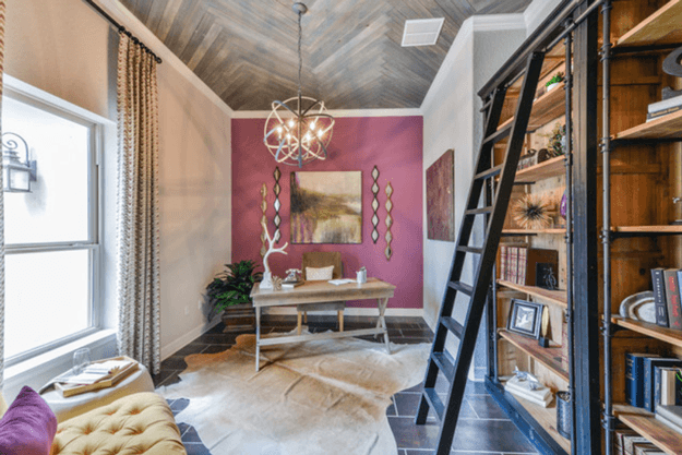 Source: conceptsandcolorways.com[/caption]
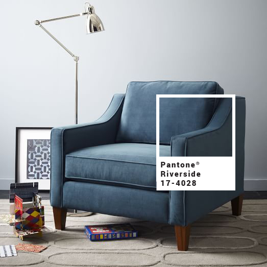
In the office – Riverside
Riverside is this fall’s top color and we can see why. This sophisticated shade of blue is cool and calming, yet strong and stable, which makes it the perfect color to surround you while you are working. [caption id="attachment_9964" align="aligncenter" width="699"] Source: westelm.com[/caption]
[caption id="attachment_9960" align="aligncenter" width="700"] Source: houzz.com[/caption]
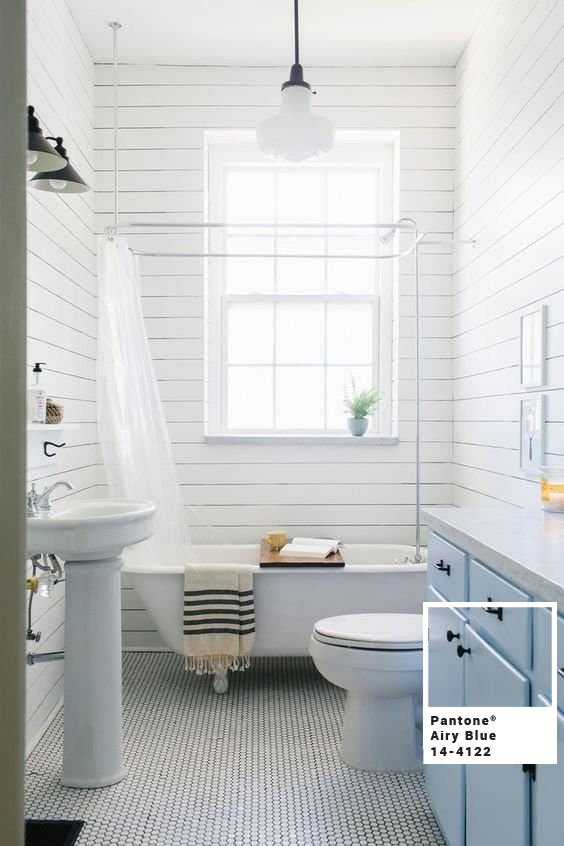
In the bathroom - Airy Blue
This shade of baby blue suggests feelings of weightlessness and comfort, which is essential in the bathroom. Pairing Airy Blue with white creates a clean and classic look. [caption id="attachment_9955" align="aligncenter" width="700"] Source: abeautifulmess.com[/caption]
[caption id="attachment_9970" align="aligncenter" width="700"] Source: houzz.com[/caption]
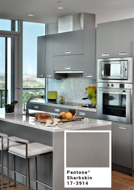
In the kitchen - Sharkskin
Even though Sharkskin is a neutral color, it is far from boring. This edgy hue of gray will pair perfectly with any of the other fall colors from this palette. [caption id="attachment_9961" align="aligncenter" width="700"] Source: houzz.com[/caption]
[caption id="attachment_9956" align="aligncenter" width="700"] Source: austinbean.com[/caption]
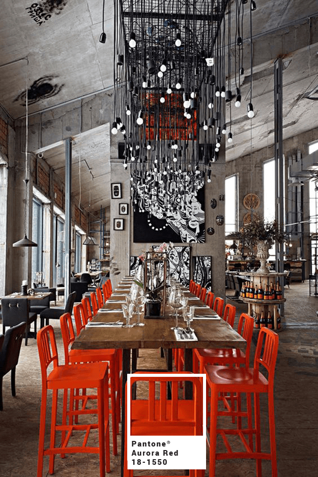
In the dining room: Aurora Red
Aurora Red is the heart and soul of this color palette. It is dynamic and bold, making it the perfect pop of color for neutral spaces. This warm shade of red will attract all of your dinner guests’ eyes. [caption id="attachment_9974" align="aligncenter" width="700"] Source: conceptsandcolorways.com[/caption]
[caption id="attachment_9973" align="aligncenter" width="700"] Source: houzz.com[/caption]
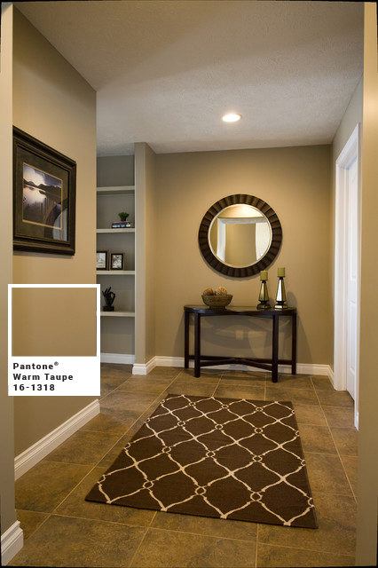
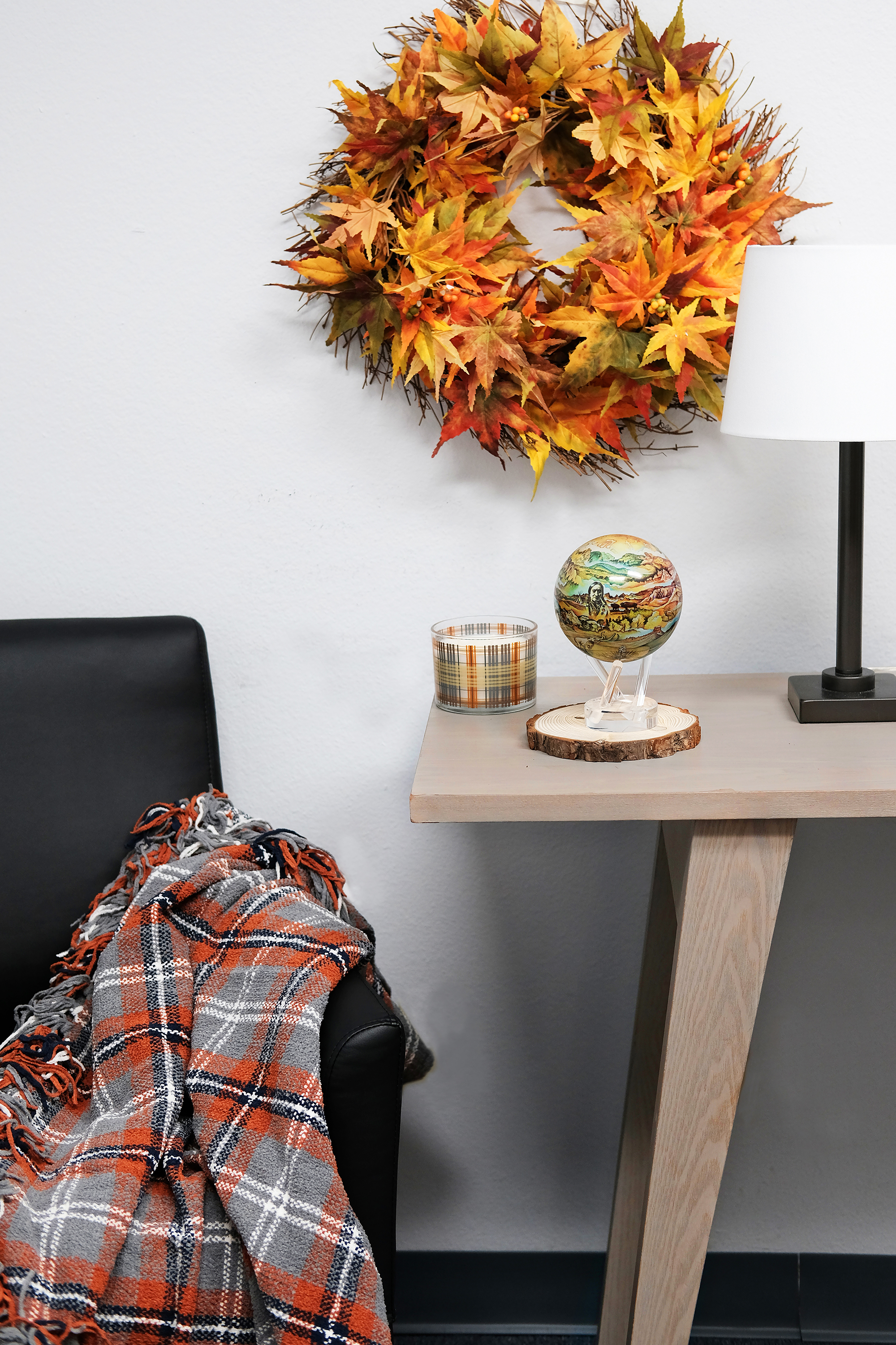
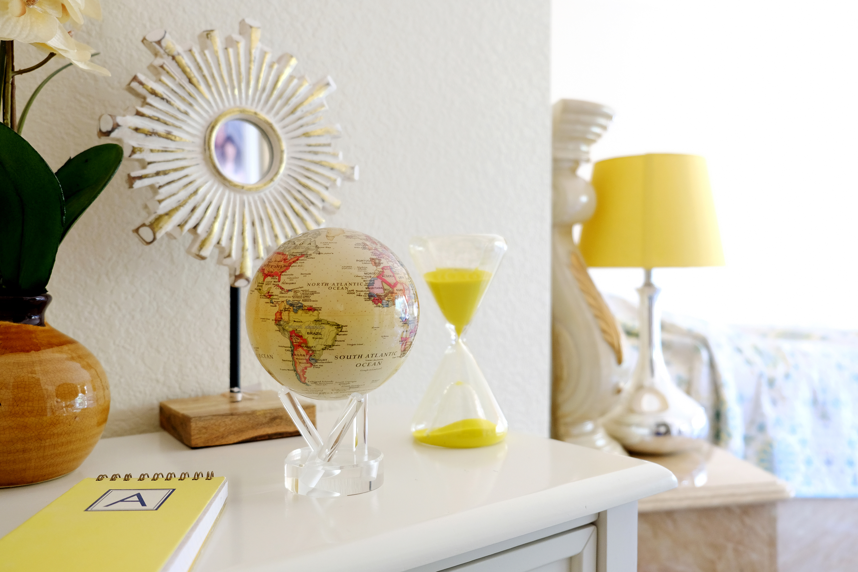
In the hall: Warm Taupe
Using Warm Taupe in your home will make it feel more organic. This hearty shade of brown suggests reassurance and stability. It is also another timeless color that will pair well with any of the other fall colors from this palette. When using Warm Taupe as a neutral, try adding a unique pattern or accent piece to your setup, like our Black Hills Termesphere MOVA Globe. [caption id="attachment_9968" align="aligncenter" width="700"] Source: houzz.com[/caption]
[caption id="attachment_9958" align="aligncenter" width="700"] Source: rebekkahdavies.com[/caption]
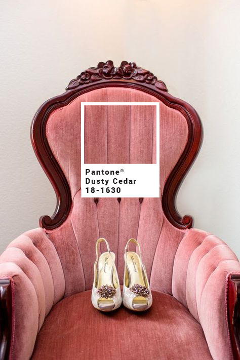
In the living room: Dusty Cedar
This dusty shade of pink makes for warm and welcoming atmosphere. Not only does it provide a modern twist, but it also makes areas feel more spacious, which is ideal for a living room full of guests. [caption id="attachment_9959" align="aligncenter" width="700"] Source: tumblr.com[/caption]
[caption id="attachment_9957" align="aligncenter" width="700"] Source: conceptsandcolorways.com[/caption]
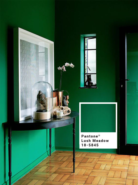
In the foyer: Lush Meadow
Give your guests an unforgettable welcome into your home with this vibrant and sophisticated shade of green. Whether you add a unique piece of colored furniture to a white wall or go all out with bright green walls, Lush Meadow is sure to bring positive energy into your home. Our Antique Terrestrial White MOVA Globe will fit right in with your bold design. [caption id="attachment_9953" align="aligncenter" width="700"] Source: home-styling.blogspot.bg[/caption]
[caption id="attachment_9954" align="aligncenter" width="700"] Source: home-styling.blogspot.bg[/caption]
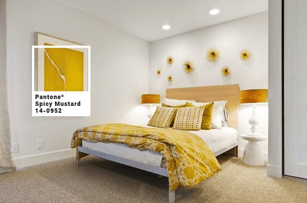
In the bedroom: Spicy Mustard
Spice it up in the bedroom with one of the most unusual and unexpected colors from this color palette. Adding a splash of this bright and sunny hue to a simple room is minimal, but can make a big difference. Our Political Map Yellow MOVA Globe complements this color well. [caption id="attachment_9969" align="aligncenter" width="700"] Source: houzz.com[/caption]
[caption id="attachment_9966" align="aligncenter" width="700"] Source: frenchyfancy.com[/caption]
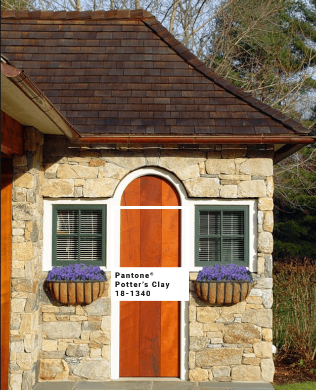
Outdoors: Potter’s Clay
When it comes to chic colors, you are not limited to indoor use. This warm orange brings crisp leaves and pumpkin picking to mind. Potter’s Clay also makes for a strong foundation when it comes to layering. [caption id="attachment_9967" align="aligncenter" width="700"] Source: conceptsandcolorways.com[/caption]
[caption id="attachment_9963" align="aligncenter" width="700"] Source: conceptsandcolorways.com[/caption]
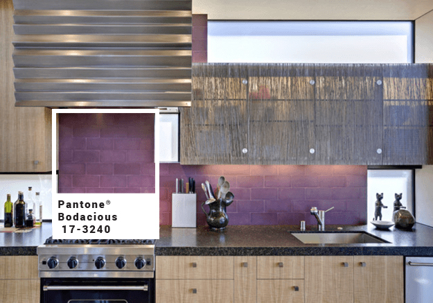
Accent Walls: Bodacious
Being another unexpected color in the collection this fall, Bodacious is sure to make a bold statement in your home. If you are feeling audacious, try adding an accent wall to a room that needs a special touch. Guests won’t be expecting to see a vibrant shade of plum in your kitchen or office [caption id="attachment_9962" align="aligncenter" width="700"] Source: conceptsandcolorways.com[/caption]
[caption id="attachment_9965" align="aligncenter" width="700"] Source: conceptsandcolorways.com[/caption]


